Servopari
Sarvopari is a newly established architecture firm based in India, catering primarily to young homeowners and business owners who are building their dream homes or workspaces for the first time. With a focus on state of the art design and tailored spatial solutions, the firm aims to create environments that align with each client’s unique lifestyle and functional needs. I was responsible for developing a visual identity that reflects Sarvopari’s professionalism, design expertise, and forward-thinking approach. The goal was to create a brand system that feels refined yet approachable positioning the firm as a trusted partner for first time builders seeking architectural excellence.
Client
Divyansh Prajapati
DELIVERABLES
Visual identity logo Design
Year
Role
Visual identity Designer
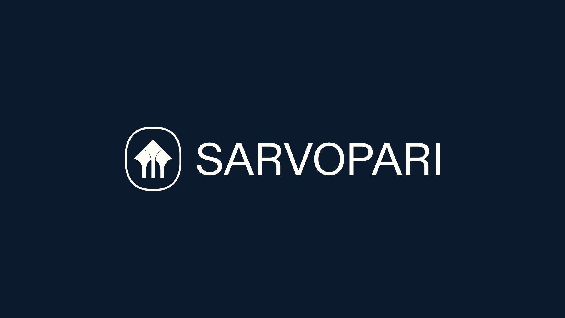
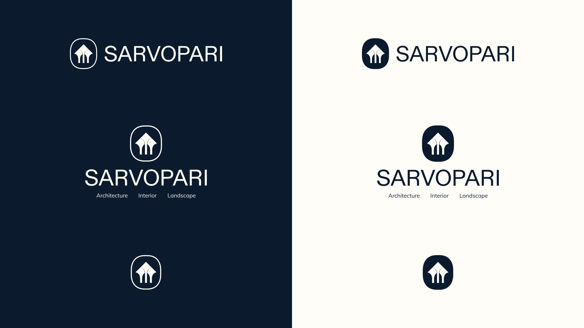
As with most of my projects, I began by exploring creative territories that are both meaningful and effective for the client. For this project, the client expressed a desire to incorporate a house into the brand icon symbolizing their core offering. Following an in depth keyword mapping and brainstorming session, I began sketching concepts that could visually represent the company’s forward thinking approach while honoring traditional Indian architectural roots, particularly the enduring strength of stone built structures. After several iterations, I arrived at a mark that brings together three core ideas: the structure of a house, the company’s innovative mindset, and the traditional pillar symbolizing heritage, stability, and foundational values.
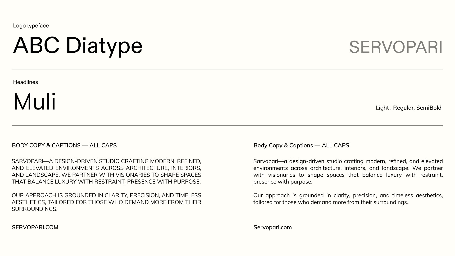
With the logomark finalized, I turned my attention to the typography a key component in reinforcing the brand’s tone. After exploring numerous type foundries, I selected ABC Diatype as the primary typeface. It felt modern yet grounded clean, confident, and professional capturing the brand’s architectural precision and forward-thinking nature. To support Diatype, I introduced Muli, a contemporary serif typeface. Its elegant forms bring a sense of heritage and sophistication, creating a harmonious balance with the geometric clarity of Diatype. Together, the pair reflects Sarvopari’s fusion of tradition and modernity. Then came the color palette the foundation for creating emotional resonance. We chose Oxford Blue, White, and Cream as the core brand colors evoking trust, purity, and warmth. To introduce vibrancy and emphasis, we added a Highlight Yellow that injects optimism and draws attention in the right moments. Supporting tones like Cadet Grey and Black complete the system, offering depth and versatility across both digital and print environments.
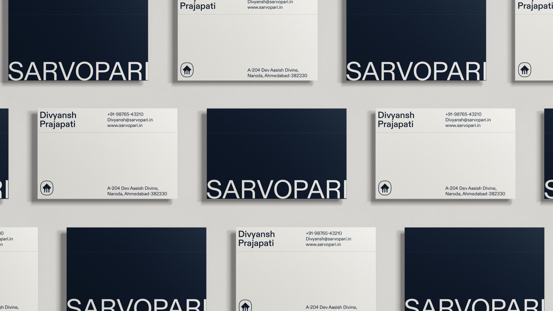
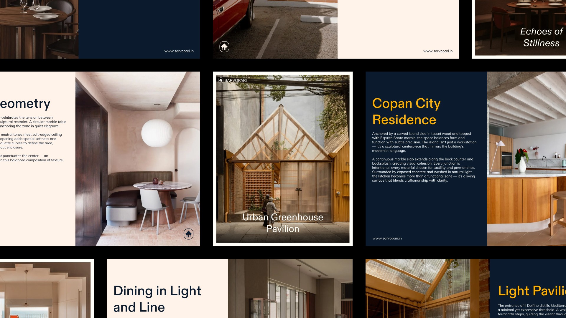
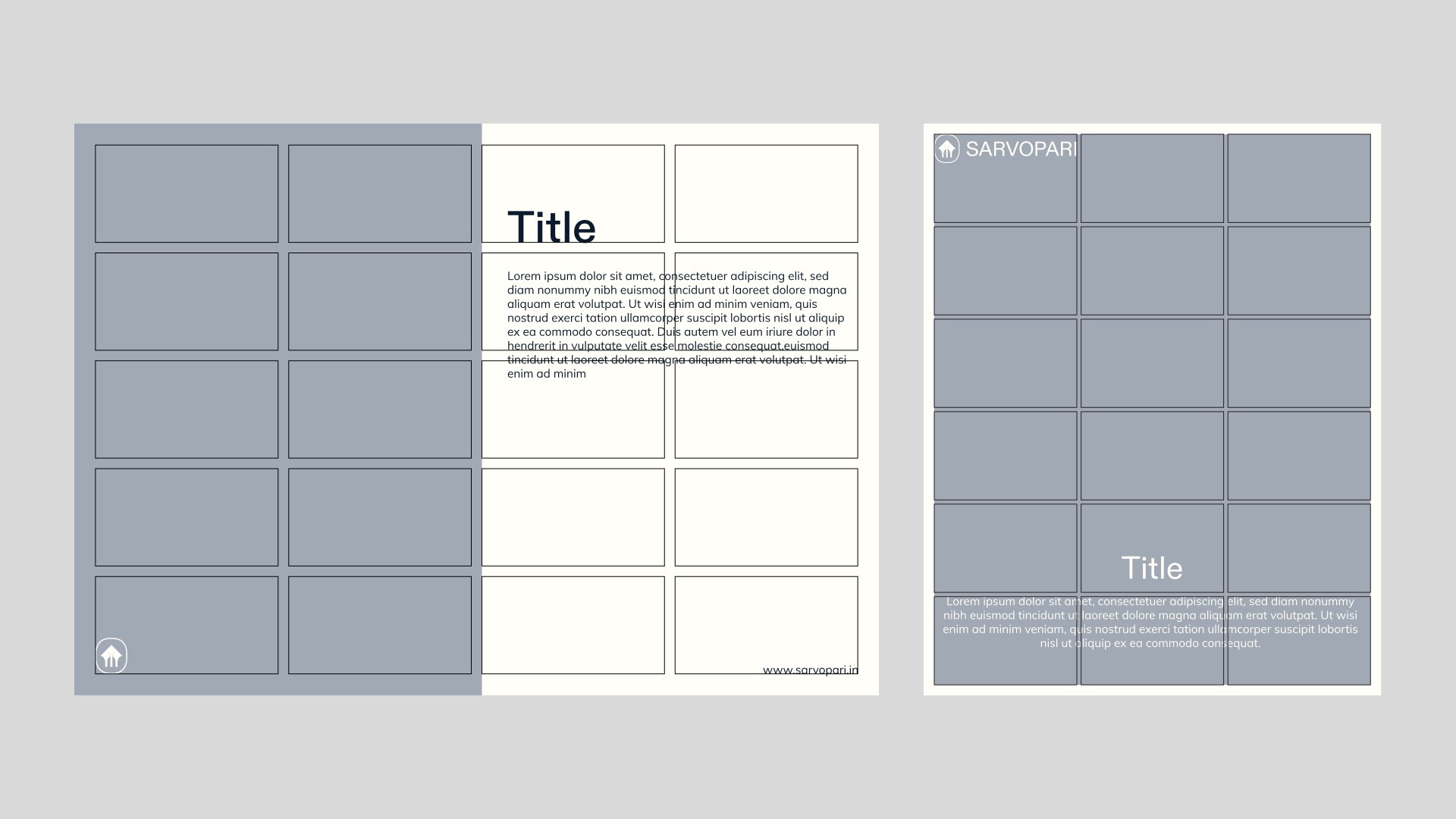
After finalizing the visual identity with a few final refinements, Divyesh approached me to help roll out the new brand across key platforms. As the brand was being introduced for the first time on Instagram, LinkedIn, and other digital spaces, he needed a set of cohesive, visually engaging assets to present it with impact and clarity. I designed a suite of editable Canva templates in multiple formats, tailored for blog post covers, project highlights, and day to day social media updates. Each template was built using the newly established identity system, ensuring consistency in type, color, and layout across every touchpoint. Additionally, Divyesh requested a set of branded stationery to support the company’s offline presence. From business cards to letterheads, each piece was designed to reflect the brand’s new tone modern, structured, and confident. While the rollout was largely implementation focused, it offered a valuable opportunity to stress test the identity system confirming that every visual element worked cohesively across print and digital formats. I was thrilled with how the assets turned out and proud to see the brand come to life beyond the logo.
